InMedia HackbyGemma GatticchiGetting started with Flourish & Figma to create beautiful custom chartsWe often combine two of our favourite data visualisation tools, Flourish and Figma, to customise our static charts. Here’s how we do it.May 20, 20221May 20, 20221
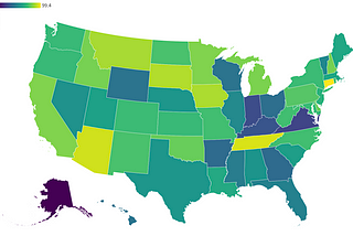
InTDS ArchivebyChuck ConnellChoropleth Maps with Pandas and FlourishA tutorial that makes a map of US polio vaccine rates using Python, pandas and FlourishSep 1, 2022Sep 1, 2022
InTDS ArchivebyChuck ConnellMapping SARS-CoV-2 Wastewater CoverageData engineering to create a Flourish map of wastewater testing by US county. Combines CDC/Biobot datasets using pandas set() operations.Mar 30, 2022Mar 30, 2022
InTDS ArchivebyChengA Visualization of Decrease in Arctic Sea Ice Extent Over Past 40 YearsAn animated data story made with Flourish…Nov 30, 2021Nov 30, 2021
BalaganeshA data visualization of the figurehead on banknotes from various countriesEver wondered what your neighboring country's currency looks like? And who is on that currency and what they are known for? Every region…Aug 10, 2021Aug 10, 2021
maheen arshadThe Royal Rumble of VisualizationsA Case for Mapping the Prevalence of ‘Adolescence-HIV’ in AfricaJun 15, 2021Jun 15, 2021
Shubhabh RustagiSolar Eclipse details in last 2 MillenniaOriginal Article Source: https://moonblink.info/Eclipse/lists/solcatJun 14, 2021Jun 14, 2021